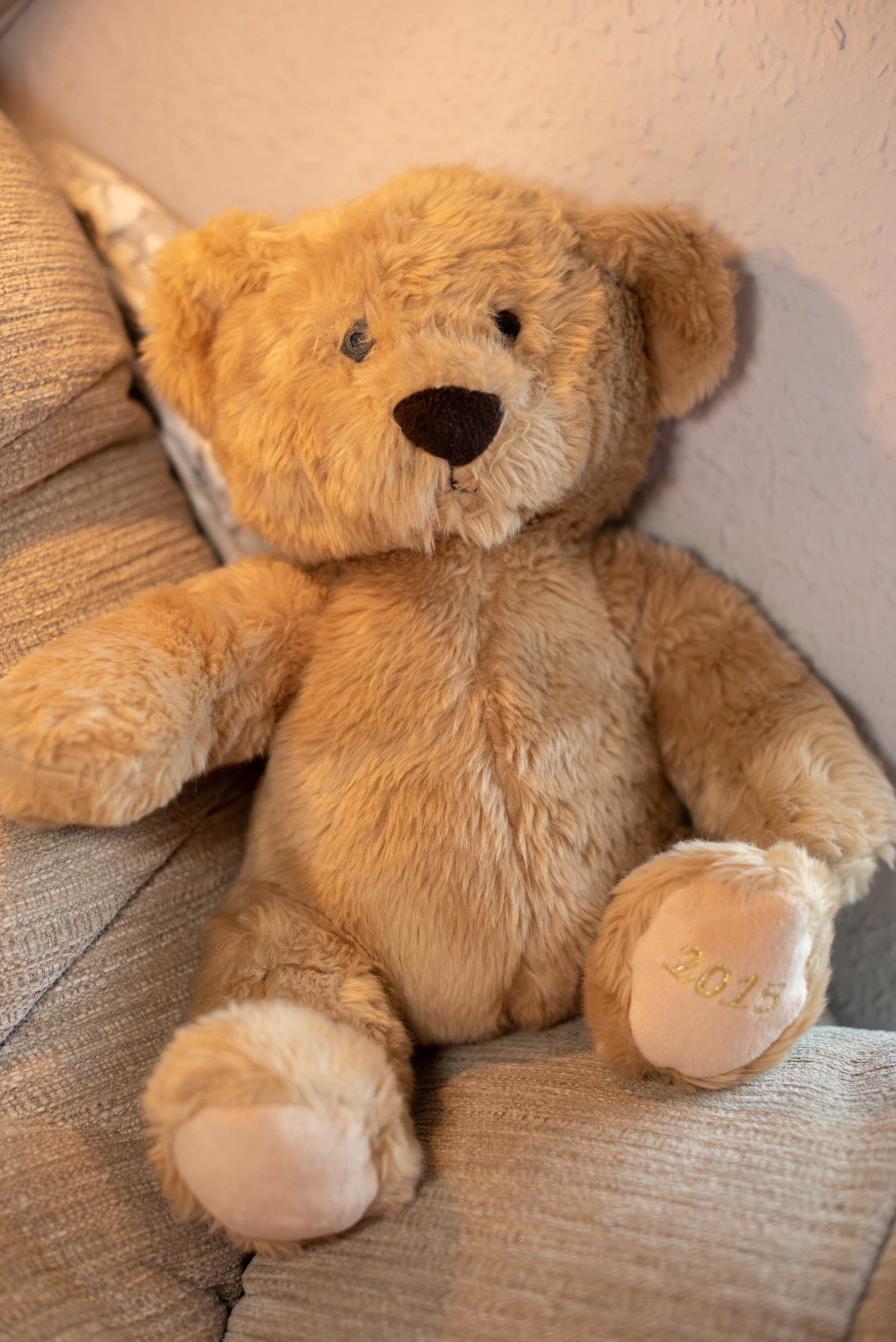
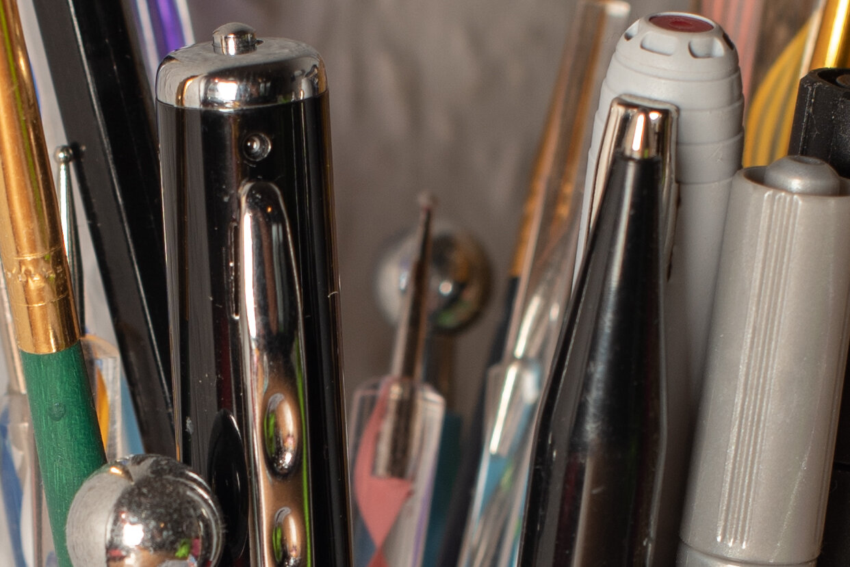
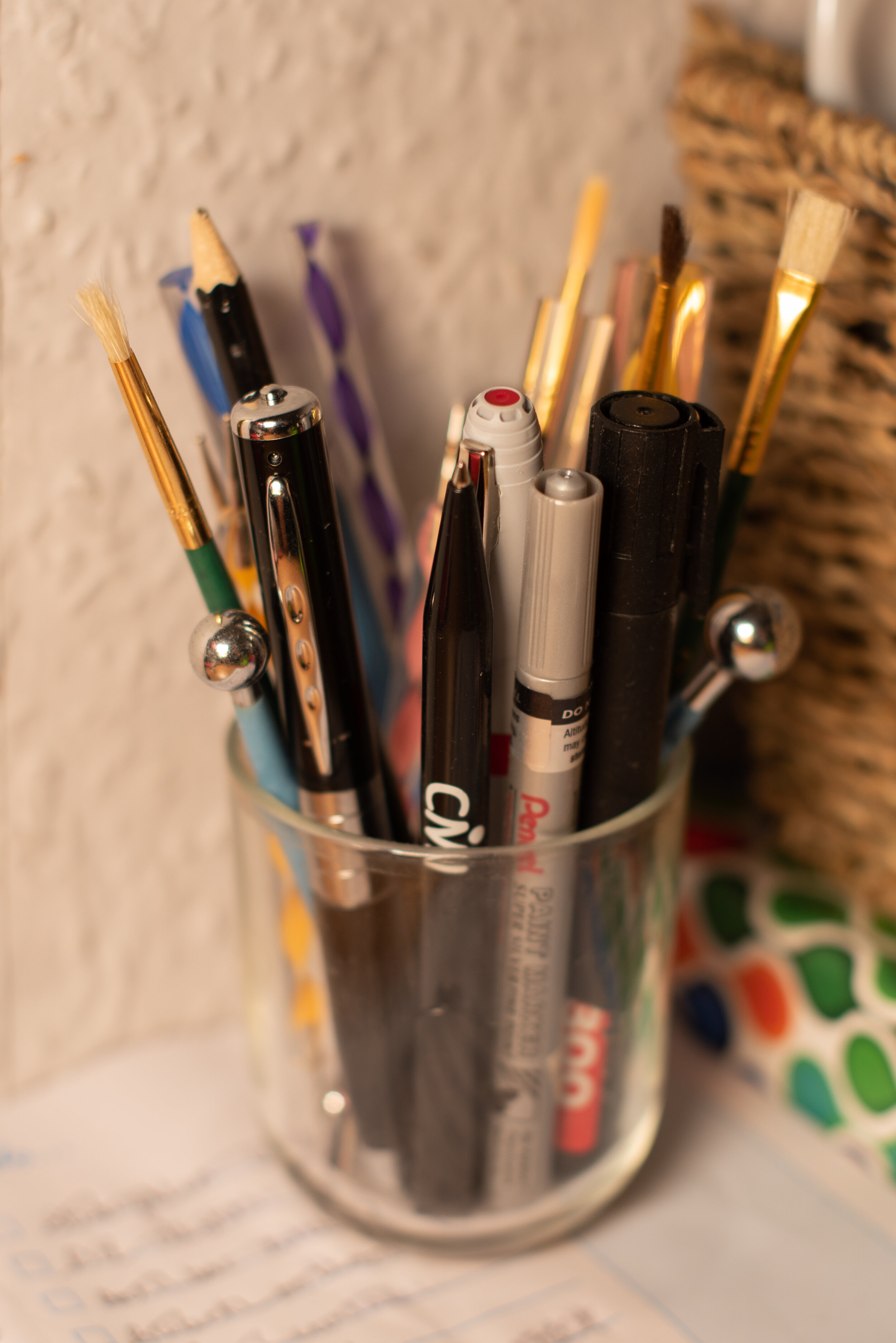
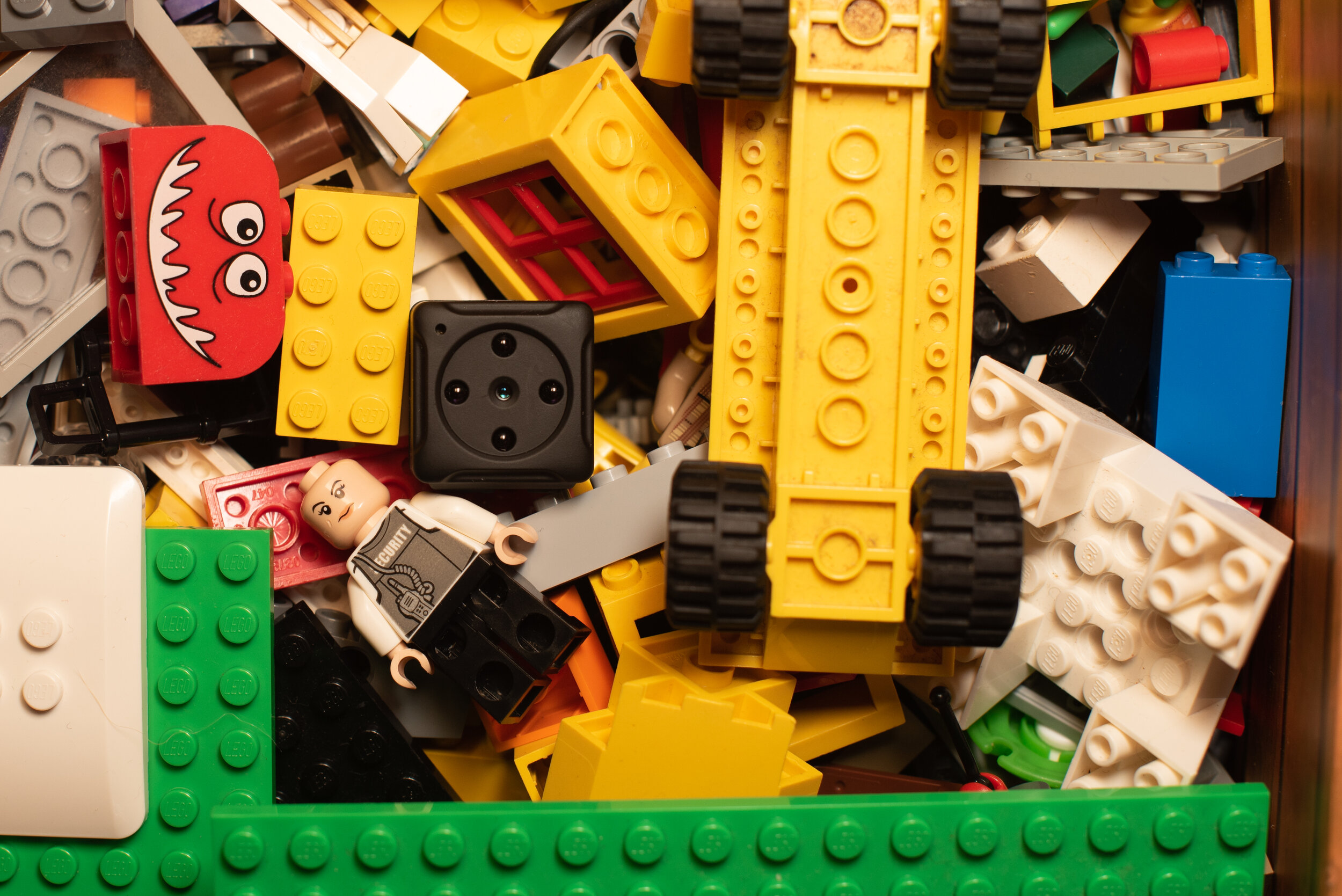
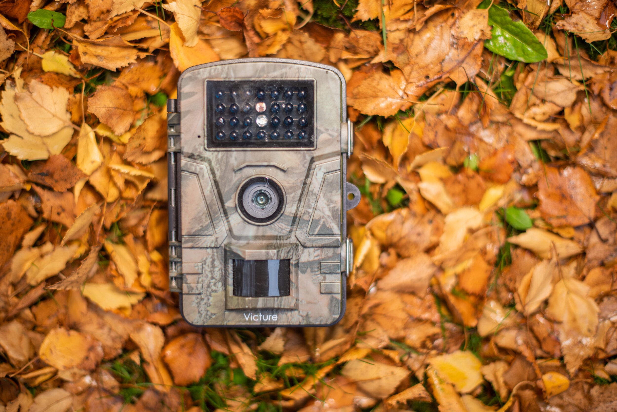
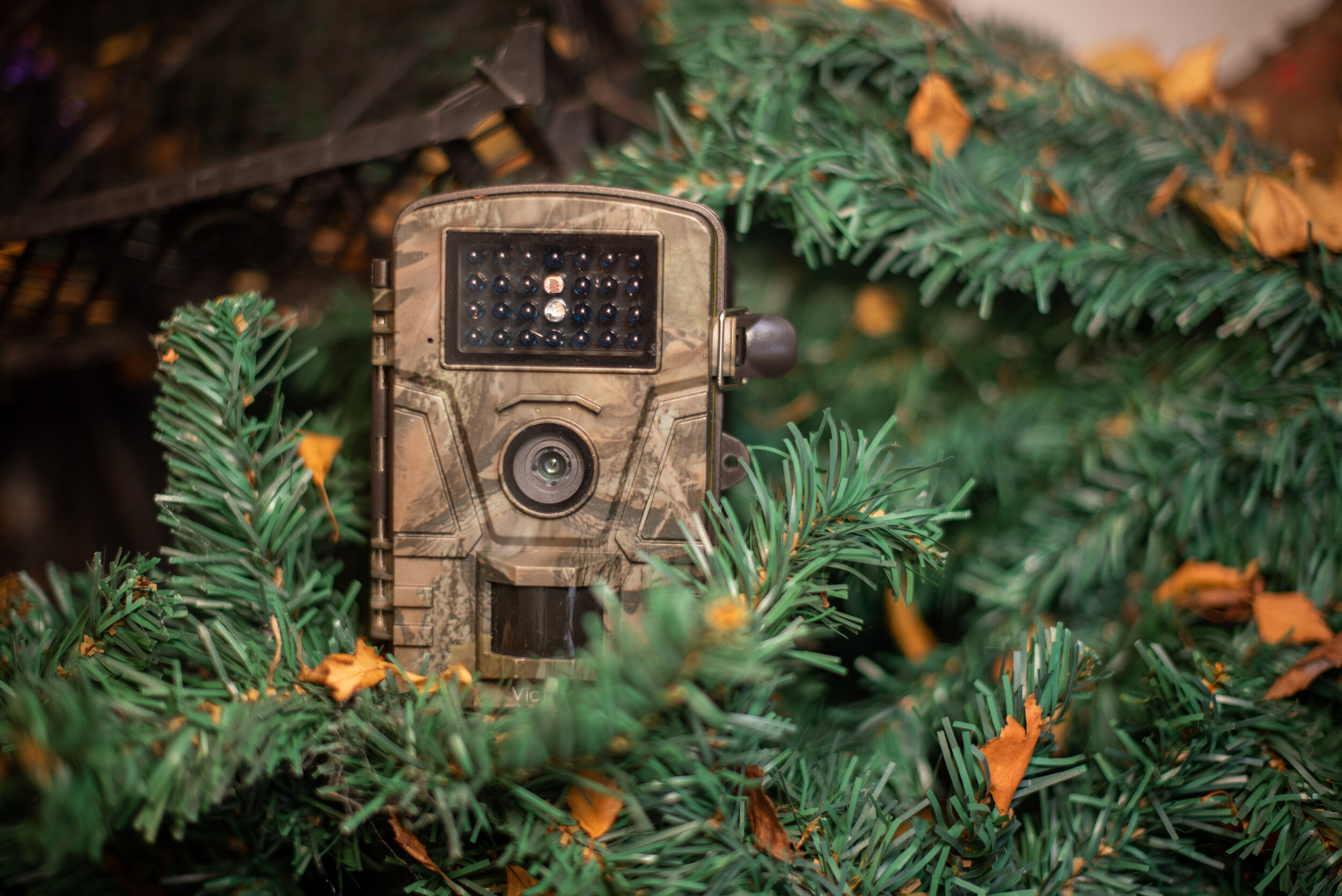
For the crit, I printed out the images where the I had the cameras on a white background, however due to the shadows created they were not great quality and made my display look very messy, so I decided to change the background, instead of having a plain white background, I thought it might be interesting to have the cameras in hidden environments but with a closer view so the audience can see them, this way they sort of match the environment in which I used them to take photographs and so they will fit with the Footage images a lot better.
I much prefer these environmental shots as they feel a lot more real. I was truly inspired by Viktoria Binschtok’s work with the street view images and then her high-quality ones, I felt they worked very nicely together and so this is why I decided to try and produce these sorts of shots. I am happy I did, next I just need to see how they work next to the footage images. And of course, I had to add a gorgeous picture of my gorgeous nephew, seeing as he is the one who allowed me to photograph his exquisite toy collection with my cameras! Also because he has a cute squidgy face.
Whilst making the contact sheets, I am not too sure what happened, but I got this! And weirdly, I quite like the overlapping idea, so thank you Photoshopping for fuking up my contact sheet; it may just be an idea for my display!
I will experiment with this overlapping idea as I feel it might just work!


