Whilst playing around the final couple bits in the book, I was making sure that everything looks aesthetically pleasing as well as in good order, I decided to use page numbers as I felt it gave the book a bit more depth and allowed me to create an index to give an idea as to what the book holds before seeing it.
I have used a number of different fonts in this book, but I wanted to emphasize the fact that jake’s nan’s life is never boring and so I did not want the font’s too always be the same.
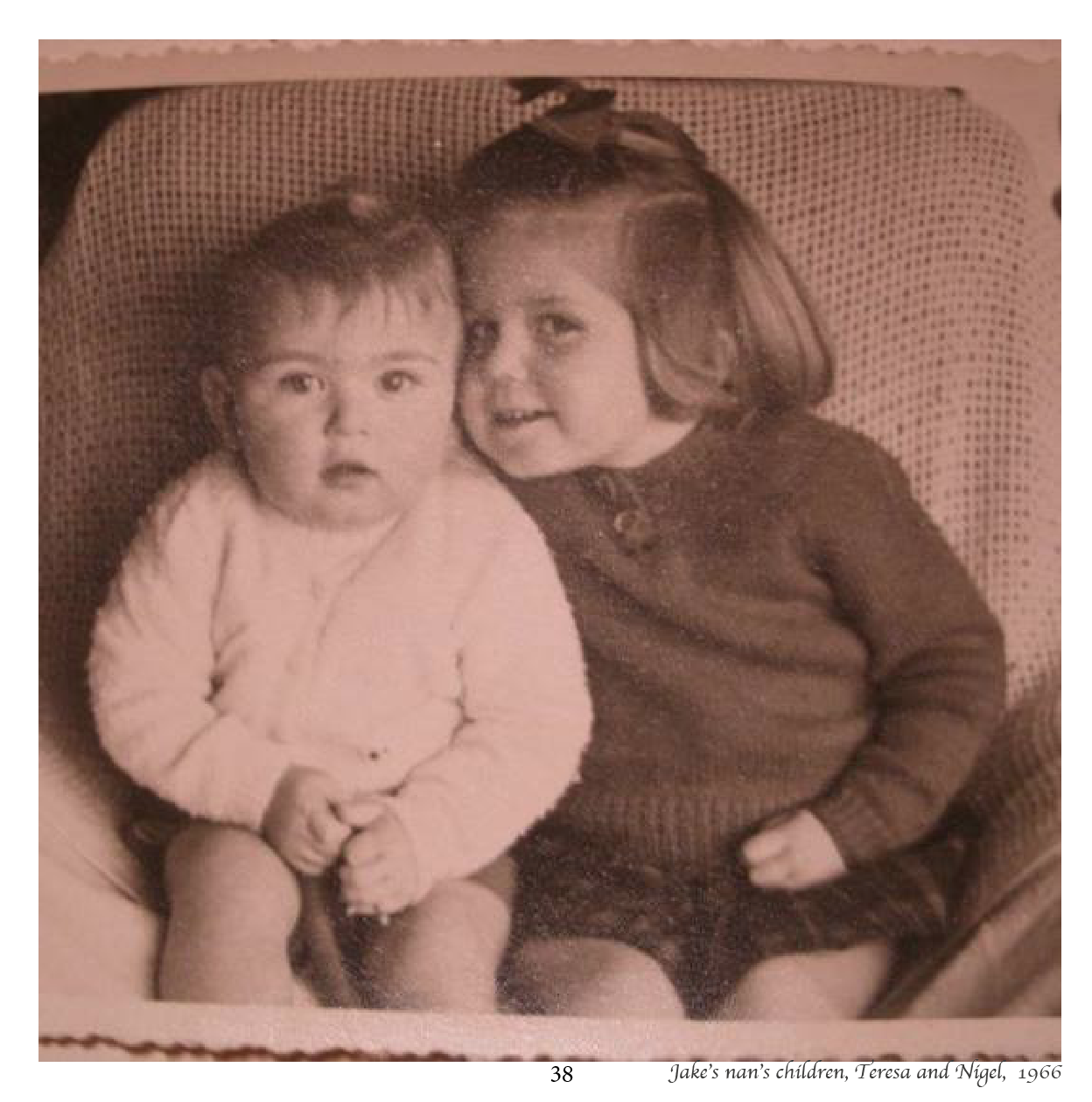
I am happy with the layout of the images on the pages and then the titles and page number beneath it, I feel it looks quite nice and adds more depth and age to it.
Originally I had planned on having single imaged next to text on each page, however after researching into a number of books I decided to have a variety of different things on different pages. So I have a good mix which allows it to be interesting throughout, which also emphasizes the fact that Jake’s nan’s life is never boring and there is always something going on.
I have written a short note just to thank the people who helped me to get the imagery together as the stories straight.
At first, i was a bit worried about the idea of using a font that I had created to make it Jake’s nans handwriting, however after putting it all together I am very pleased with the outcome.


